Free Template: Color Contrast Audit for Accessible Design
Insufficient color contrast: it’s a simple problem, with a huge impact. In fact, it’s one of the most common accessibility problems on the internet today. Without good color contrast, most web users, including those with visual impairments, will have a harder time engaging with your digital experiences and interacting with your brand. So what’s the solution?
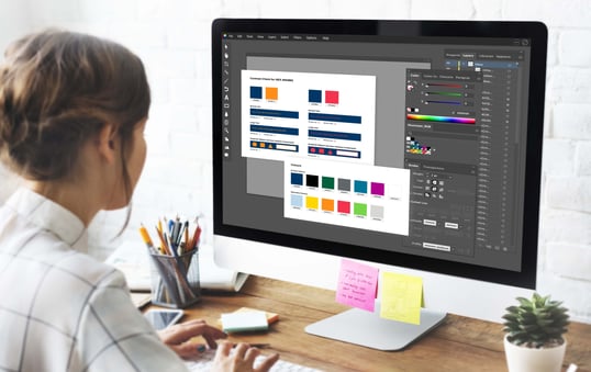
Accessible design begins in your style guide. Whether yours is still developing or is already built, you can start improving it today by completing a color contrast audit with our simple templates.
Test your brand colors or a project-specific palette with this all-in-one template.
- Download and import the correct file format (EPS, SVG, or Sketch).
- Add your brand or project colors including the HEX value or equivalent.
- Test each color against the others using the contrast checker of your choice.
- Use one artboard per color.
- Fill in the artboards with the results of the contrast checks, and create new artboards as needed.
Here’s to beautiful digital design—accessible right from the start.